Why Auth Branding Matters
Your authentication flow is often the first interactive experience a user has with your product. If your sign-in page looks generic, or your password reset email looks like spam, you're starting the relationship on the wrong foot.
Great auth branding does three things:
• Builds trust — Users are more likely to enter credentials on a page that looks professional and matches the site they came from.
• Reduces confusion — Branded emails are recognized and opened faster than generic ones.
• Creates consistency — The experience from landing page to sign-in to dashboard feels like one cohesive product.
Auth Plugin gives you full control over every visual touchpoint.
Customizing Sign-In and Sign-Up Forms
Every form component in Auth Plugin is customizable through Framer's property controls. Select the component on your canvas and adjust:
Accent Color — Controls the primary button color and input focus rings. Match this to your brand's primary color.
Border Radius — Set to 0 for sharp corners, 8 for modern rounded, or 999 for fully pill-shaped inputs and buttons.
Button Text — Change the default text. "Sign In" could be "Log In", "Get Started", "Continue", or anything that fits your voice.
Error Messages — Toggle inline validation errors on or off.
Since these are native Framer components, they inherit your project's fonts and respond to your layout constraints. You can wrap them in any Framer container, add background colors, borders, or shadows — they behave like any other Framer element.
Branding Your Transactional Emails
Auth Plugin sends four types of transactional emails:
• Welcome Email — Sent after a user registers.
• Password Reset — Sent when a user requests a password reset.
• Magic Link — Sent for passwordless sign-in.
• OTP Code — Sent for verification code authentication.
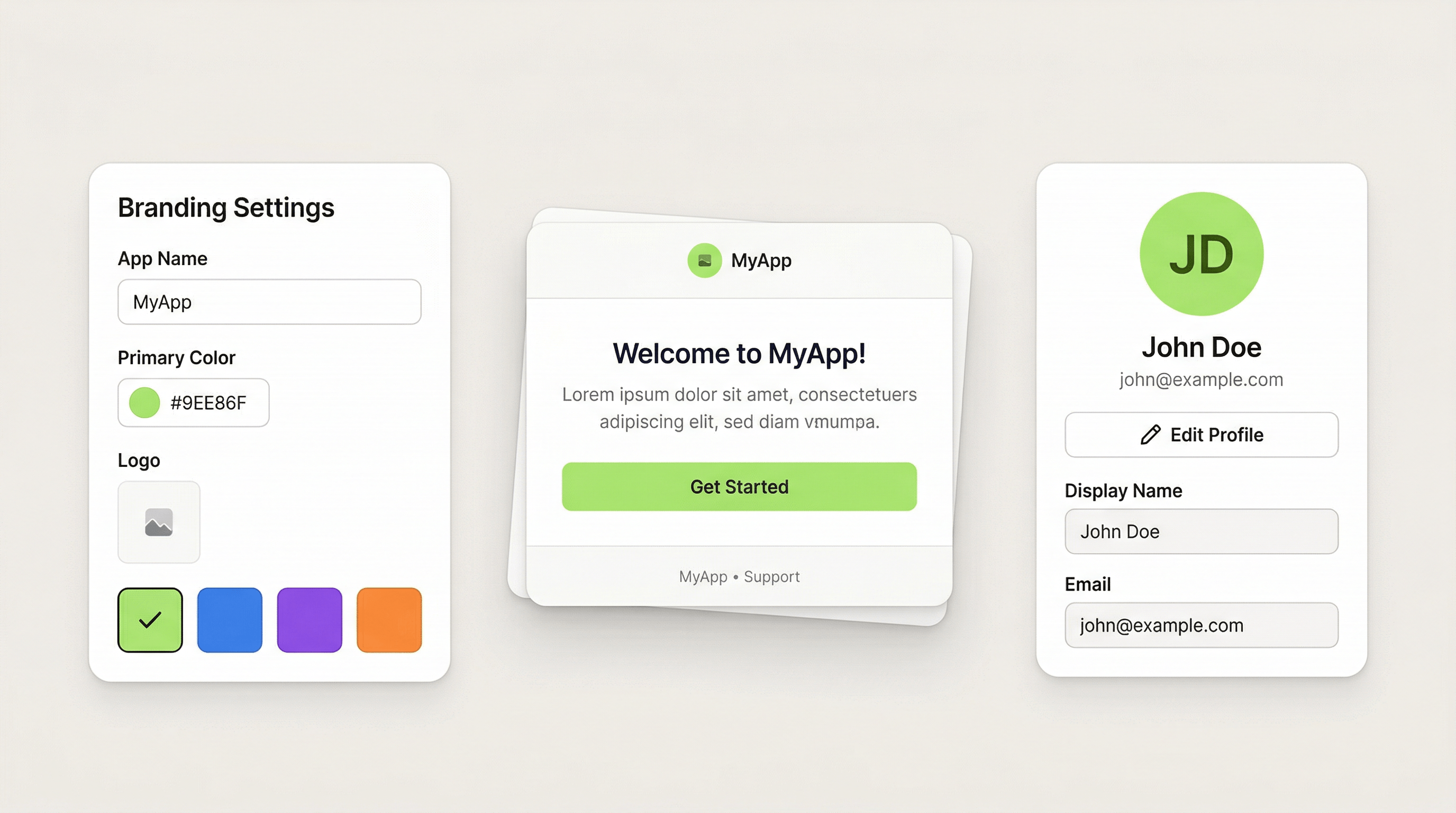
All four use your branding settings. Go to Auth Plugin > Settings > Branding and configure:
• App Name — Appears in the email header and subject line.
• Logo URL — Your logo displayed at the top of every email. Use a hosted image URL (recommended size: 200x50px, transparent PNG or SVG).
• Primary Color — Used for CTA buttons and accent elements in the email.
• Button Text Color — The text color on CTA buttons (usually white or dark depending on your primary color).
• Support Email — Shown in the email footer so users know where to get help.
Preview your emails in Settings > Email Preview before publishing to make sure everything looks right.
Building Profile and Avatar Pages
After signing in, users expect to manage their identity. Auth Plugin provides two components for this:
Profile Form:
A pre-built form that auto-populates with the user's current data. Users can edit their display name and email. The form includes validation, a save button with loading state, and success feedback. Drop it on your /account page.
Avatar Component:
Displays the user's profile picture. When no photo is uploaded, it shows the user's initials (e.g., "JD" for John Doe) with a colored background. Users can hover over it to see an upload button. The avatar integrates with the Profile Form — both read from and write to the same user data.
Place the Avatar in your site header or dashboard navigation so users always see their identity. It reinforces the "logged in" state and adds a personal touch.
Displaying User Identity Throughout Your Site
You're not limited to the profile page. Auth Plugin lets you show user data anywhere on your site:
Identity Label Component:
A text element that dynamically shows the user's name or email. Use it in headers ("Welcome back, Sarah"), sidebars, or any page where you want to greet the user.
IdentityName Code Override:
Apply this to any existing Framer text element. It replaces the text content with the user's name. This means you can use your own typography, colors, and layout — the override just swaps the text.
IdentityEmail Code Override:
Same as above, but shows the email address. Useful for account pages or settings screens.
These tools let you create a personalized experience that feels custom-built, even though it took minutes to set up.
Auth Design Patterns That Work
Centered auth pages — Place your sign-in form in the center of a clean page with your logo above it. Add a subtle background pattern or gradient. Keep the page minimal — no navigation, no footer, just the form.
Split-screen layout — Left side: an image, testimonial, or feature highlight. Right side: the auth form. This works well for SaaS products that want to reinforce value during sign-in.
Inline auth — Instead of a separate page, embed the sign-in form in a section of your landing page. Use code overrides to swap between the form and authenticated content.
Consistent header state — Use ShowWhenGuest for "Sign In" and "Sign Up" buttons, and ShowWhenAuthenticated for the Avatar and Sign Out button. The header adapts to auth state seamlessly.
Personalized dashboard greeting — A large "Good morning, Sarah" heading using IdentityName override, paired with an Avatar component and relevant dashboard content below.